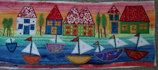
Thought you might like to see how I built up a picture that just finished.
First up about 8 layers of teabag tissue.
Next slap on some paint in varying stripes, I used watercolours but any paint would do. Then oversew with different sorts of stitches on the machine (mine is just a cheapo Tesco one so nothing tricky!)
Don't you think it looks a bit like material the sort that has a soft quilty feel to it.
Next up is thinking about what to put on it. I wanted to make a bigger ship type picture, so put in some boats and trees.
These were lightly sprayed with 505 spray glue to anchor them whilst doing a close zig zag stich around the body of the boats. The trees are also zig zag.
Next attaching some houses with random pieces of fabric, all cotton.
Adding the sailes also with zig zag. The masts are running stitch up and down a few times.
Fiddly bits of windows and doors. I did try and black ink the panes in but it didnt work very well.
The finishing touches of painting in numbers on the sails and adding details to the doors and windows.
Close up of some of the details.
Hmm photo a bit squint there but not in real life. The colours are a bit darker and more vibrant also. Now in it's frame BUT what did I do.... broke the glass as I was putting it in. I was so mad with myself! So its a bit floppy without the glass to keep it all together. But at least there is no reflection glare!! I picked the frame up in a charity shop last year and it was perfect for this project. I will have to now take it to the framers to get a bit of glass to fit. So people be careful and dont rush and dont put it on a soft surface (I balanced it on the sofa so nobody to shout at except myself!)
It will be going into the bathroom....eventually.
Its funny how my tastes have changed so much over the years. At one time I wouldnt have liked this sort of work, I liked Victoriana and heavy stuff. I suppose with the event of the internet there is so much more variety of styles and colours and materials than way back then. I am turning to more bright colours and I also like some niave American type pictures (this is what I was trying to achieve here, although the sky reminds me of an Jamacian sky!)
Anyway I hope you like it and it gives somebody some inspiration to try different materials and just go for it.


I love it! It's just stunning.
ReplyDeleteLove it, it looks so lovely!
ReplyDeleteIt's fantastic, love it! xxx
ReplyDeleteThat is just so effective you clever lass you!
ReplyDeleteThat is a wonderful piece of work and a perfect tutorial.
ReplyDeleteThank you for coming on to my site and leaving a much appreciated comment.